Administration Experience, Workhuman

Workhuman, a SaaS business, provides recognition programs where colleagues award each other points for good job performance or life events.The Recognition Program Managers (RPMs) were facing significant challenges in managing large volumes of awards that were stuck in the approval process.Due to the complexity of the data involved, including multiple filtering criteria such as countries, departments, people, roles, award values, and text data, RPMs struggled to manage these awards efficiently. This impacted the user experience and, more critically, affected the subscription renewals and client retention rate since RPMs were often decision-makers in renewing Workhuman services.
My responsibilities
Current System Data Analysis (Heap)
This helped us identify user behavior patterns:Users frequently bounced from the report page, indicating that the current filtering system wasn't fulfilling their needs.We were able to identify the most commonly used actions and data types, which helped us prioritize filter options in the redesign.
User interviews (6 users)
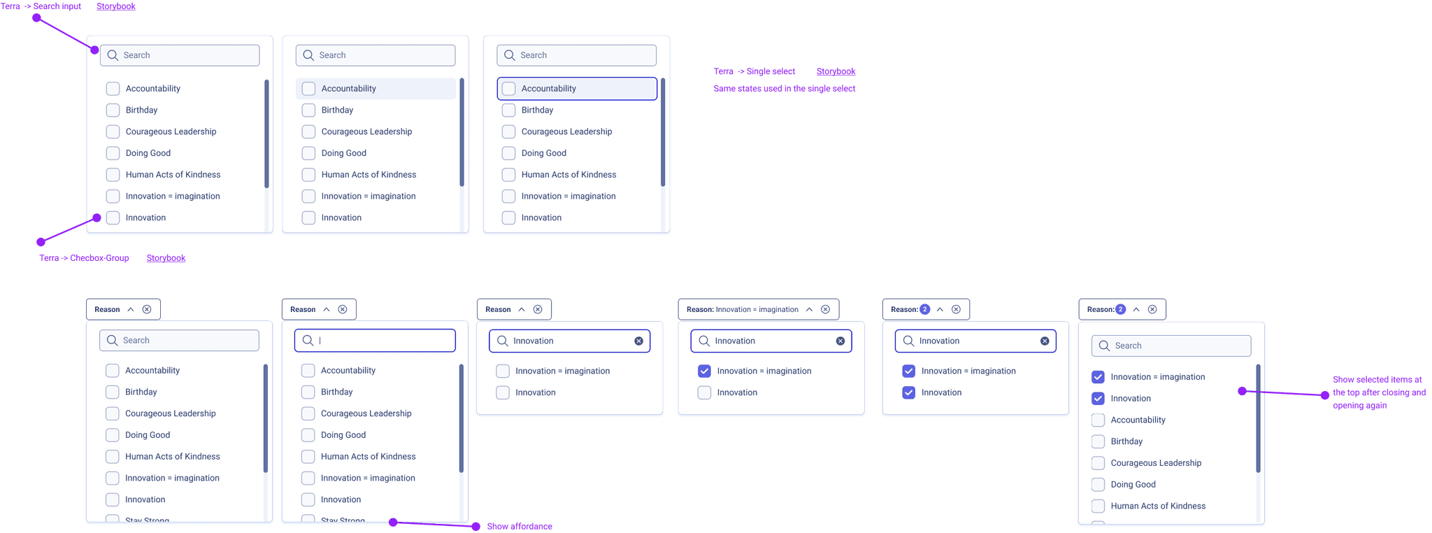
Users needed to filter by Approver, Nominator, and Recipient.They wanted a way to quickly switch between search results to perform multiple actions in succession.
Business Canvas Workshop with Stakeholders & Engineers
We clarified:The user outcomes we aimed to achieve.Hypotheses about user behavior.Key metrics to track success (bounce rates, filtering accuracy).User benefits and potential challengesEngineering redlines
Ideation and Design
We conducted a collaborative session with designers to brainstorm different design approaches.
Key exercises included:
User flows to map how users would navigate the filtering system.
Storyboarding to visualize the user journey, particularly focusing on the approval and actioning process for blocked awards.
Later we built a first prototype.
User testing
Tested with 6 users. Plus we run a A/B testing with 50+ users.SUS Score Round 1: 81.25 pointsSUS Score Round 4: 93 points
Pain points & solution
Pain
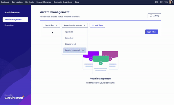
Overwhelming Volume of Data: With users needing to filter through large amounts of data across multiple fields like countries, departments, roles, and award values, the existing filtering system was insufficient
Solution
We implemented a customizable filter system where users could add or remove filters as needed, providing greater flexibility. This approach, inspired by systems like Jira and Heap, allowed users to tailor their filtering experience to their specific needs.
Pain
In the initial design, filters were split into two sections, causing confusion and frustration. Users expected all filters to be in one place and found it difficult to navigate between the separate sections.
Solution
We redesigned the filtering interface to present a unified filtering system, consolidating all search options into a single, cohesive layout.
Pain
Users needed to filter by role (Approver, Nominator, Recipient) across different search criteria like employee number, email, and name.
Solution
We introduced a search field with a drawer system where users could search by an individual’s name, email, or employee number, and then choose their role in the approval chain
Design System Components
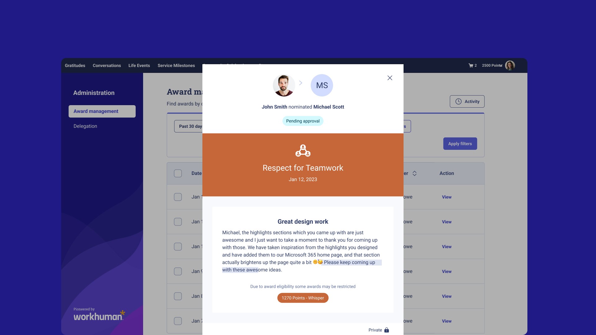
Designed different views so the user can understand their commitment and budget consumption. As well I added detailed tooltips to give a closer perspective of the information.

Prototype


KPIs
+16%
Retention rate
+30%
NPS Score
95 pts
SUS Score
Chacho Herraiz, Senior Product Designer.
Contact me
Chacho Herraiz
igdh.creative@gmail.com
©Chacho Herraiz 2024