Billing dashboard, Intento
The task was to create a Billing Dashboard that consolidates all the necessary billing details. The objective was to allow users to monitor their commitment usage, analyse their spending, and track savings on their Intento subscriptions, all while clearly breaking down fees and ensuring real-time updates on their contract status.
Intento, a machine translation and localization services provider, offers various products and services to enterprise clients. These clients often have complex billing structures based on their usage of multiple Intento services. The existing billing system was essentially a report sent monthly to the client, but no real time data available.
My responsibilities
Stakeholder Workshops
Engaged in discussions with product managers and account managers to understand the pain points faced by enterprise clients in navigating and understanding their billing data.
User interviews
Interviewed existing customers to gain insights into how they were currently managing their usage, where confusion often occurred, and what features they felt were lacking in the existing solution.
Current System Data Analysis (Heap)
Used internal analytics tools to assess user behavior in the existing billing section of the Intento dashboard.
Many users failed to monitor their usage regularly, leading to over-commitment or unexpected billing
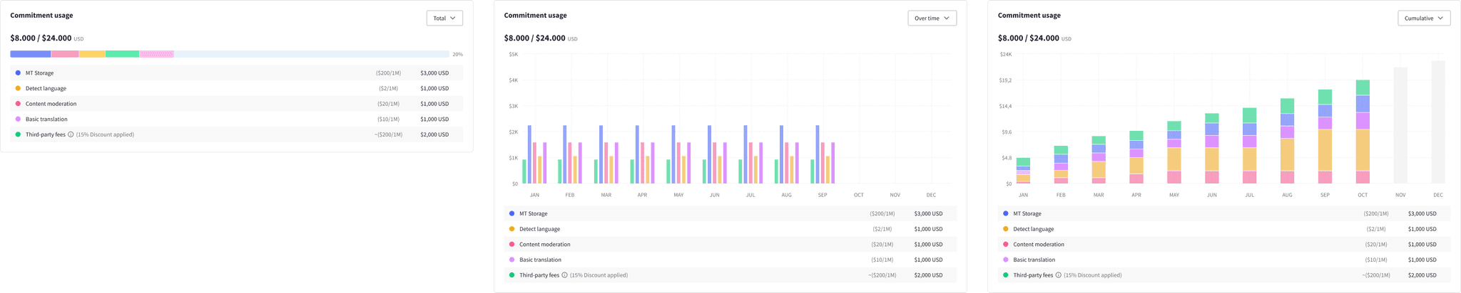
Produced low-fidelity wireframes in Figma to outline key components such as:
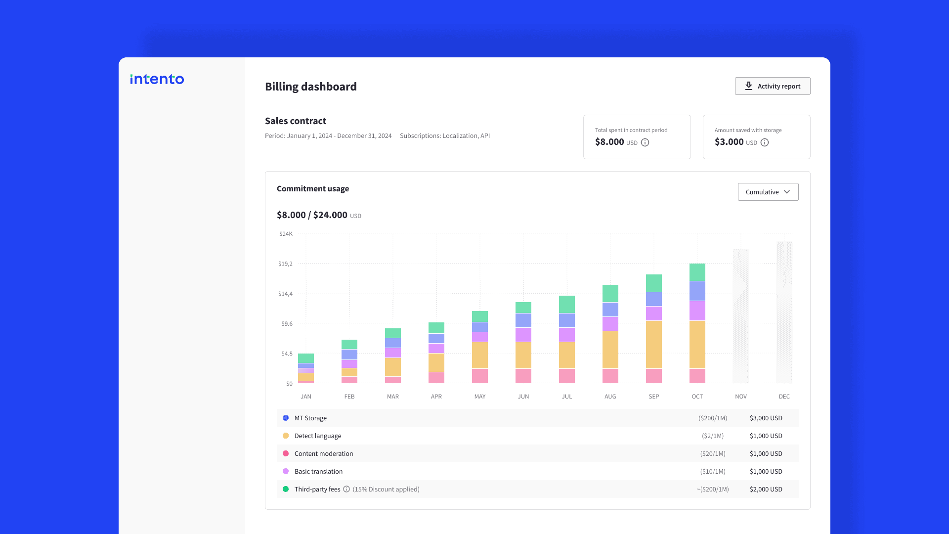
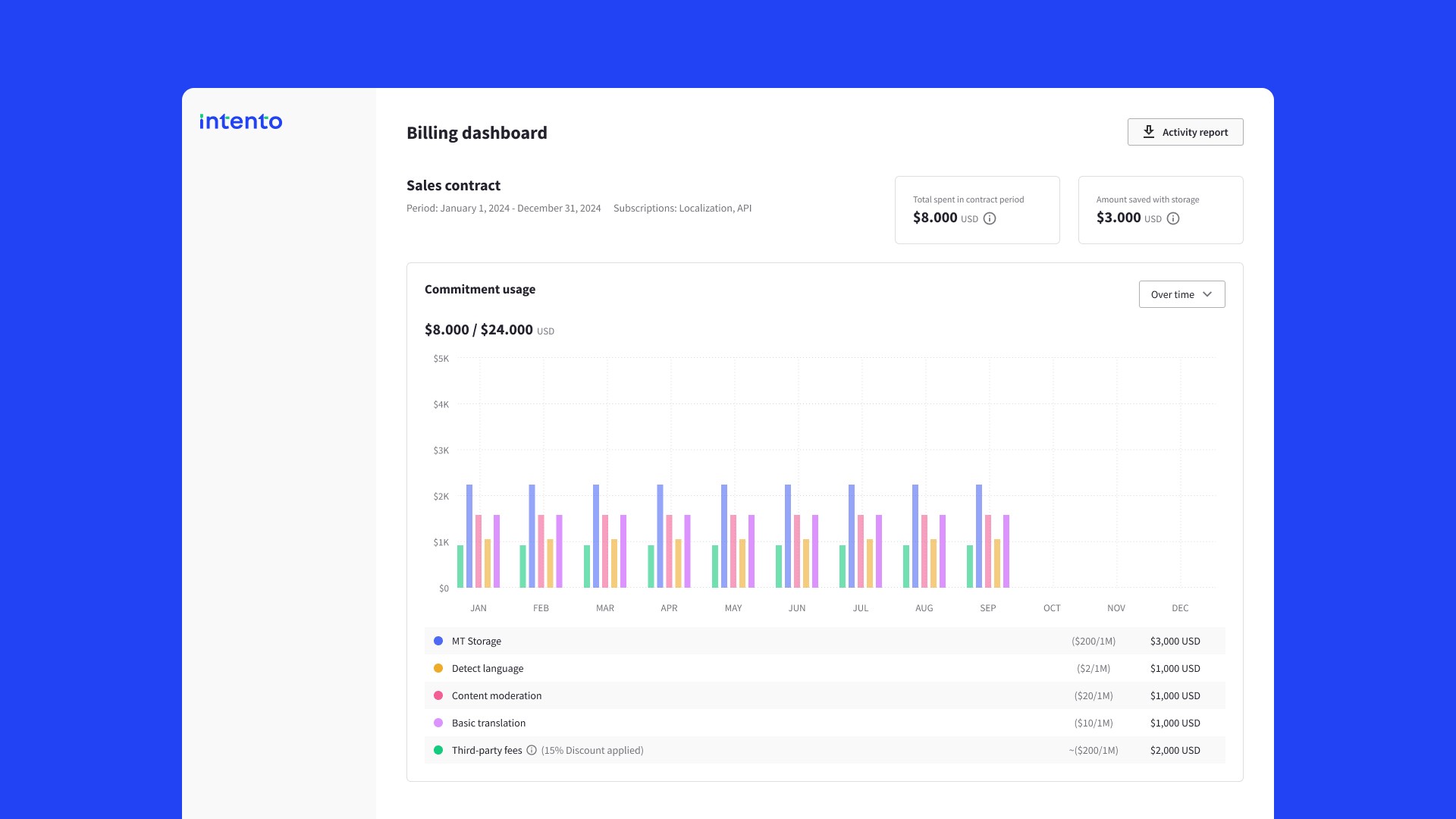
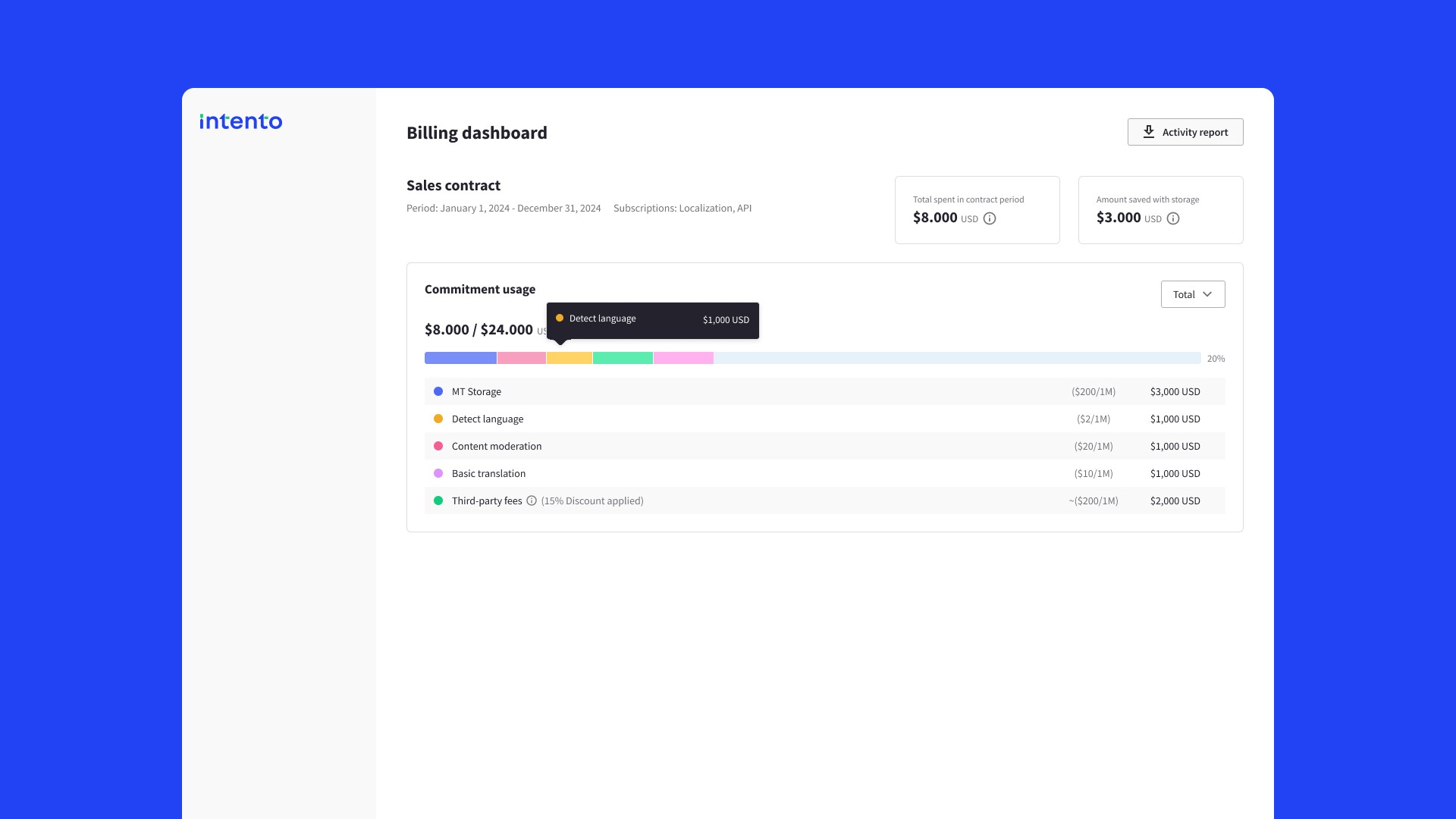
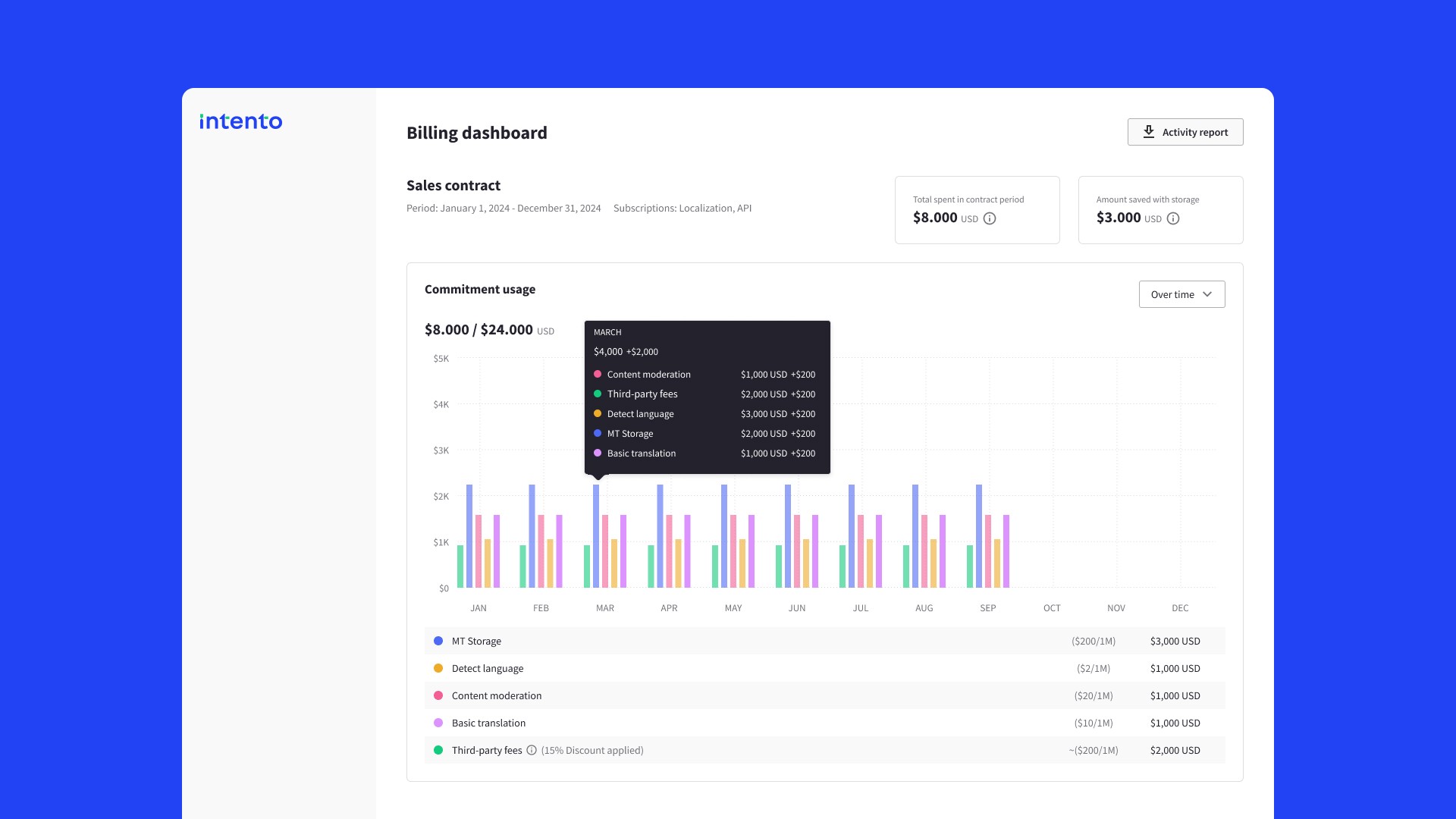
Commitment usage bar: A progress bar showing the amount spent out of the total contracted amount.
Detailed breakdown: A section breaking down the costs for each individual service (e.g., MT Storage, Content Moderation).
Savings: A dedicated area highlighting the amount saved through specific features (e.g., discounts for using certain services).
User testing
Tested with 6 users. The primary objective of testing the newly designed billing dashboard was to assess its comprehensibility—to ensure users could easily understand key billing information.
Pain points & solution
Pain
Users struggled to understand their overall commitment usage and where they were in their billing cycle.
Solution
Implementation of a visual Commitment Usage Bar, where users can see their current spending against their total contract
Pain
Complex billing structures for multiple services created confusion
Solution
A breakdown section that itemizes each service with clear labels and associated costs. Dynamic filtering options were included to view total costs or costs per service (e.g., MT Storage, Content Moderation).
Pain
No warnings were in place when users approached or exceeded their committed usage.
Solution
Introduced states like Over Commitment that alert users when they are approaching or have exceeded their contract’s limits, ensuring they are aware of potential additional charges.
Components
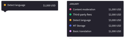
Designed different views so the user can understand their commitment and budget consumption. As well I added detailed tooltips to give a closer perspective of the information.
Prototype


KPIs
20%
Reduction on average payment time
80%
Positive feedback
25%
Reduction in Customer Support Inquiries
Chacho Herraiz, Senior Product Designer.
Contact me
Chacho Herraiz
igdh.creative@gmail.com
©Chacho Herraiz 2024