Checkout optimisation, Bloggle
I redesigned the checkout experience for Bloggle, a Shopify blogging platform that enables merchants to create high-performing content through drag-and-drop editing, SEO scoring, and advanced layout options. The goal was to simplify the pricing and subscription flow, reduce user friction, and resolve visual and technical limitations—particularly around how add-ons were displayed and handled. The original experience relied heavily on Shopify’s default checkout system, which lacked flexibility, brand alignment, and clarity in communicating value across plan tiers and optional features. This led to user confusion, lower conversion rates, and frequent support inquiries.
My responsibilities
Comparative Review
Analyzed bloggle.com and leading SaaS pricing flows (e.g. Notion, Framer, Webflow).
Reviewed Shopify’s default checkout UI and its technical constraints, especially the rigid plan structure and lack of dynamic pricing visibility.
Previous solution analysis

Unclear visual hierarchy in CTAs made it difficult for users to distinguish plan benefits and add-on pricing.
Inconsistent with brand guidelines, weakening user trust and visual continuity.
Users struggled to understand what each plan included and how it differed.
Layout lacked scalability, making it hard to introduce new plans or add-ons in the future.
Upgrade paths were confusing, particularly between the Pro and Business tiers.
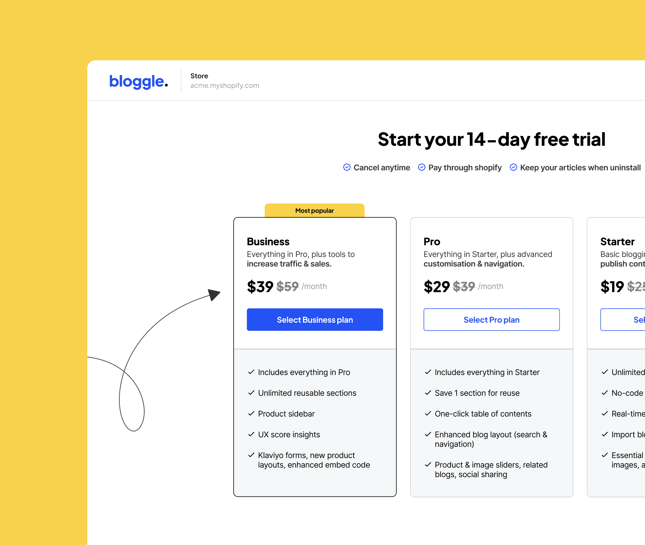
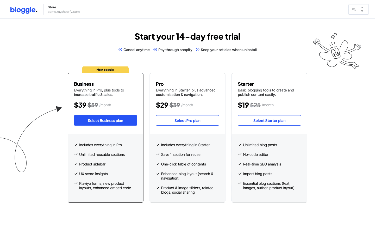
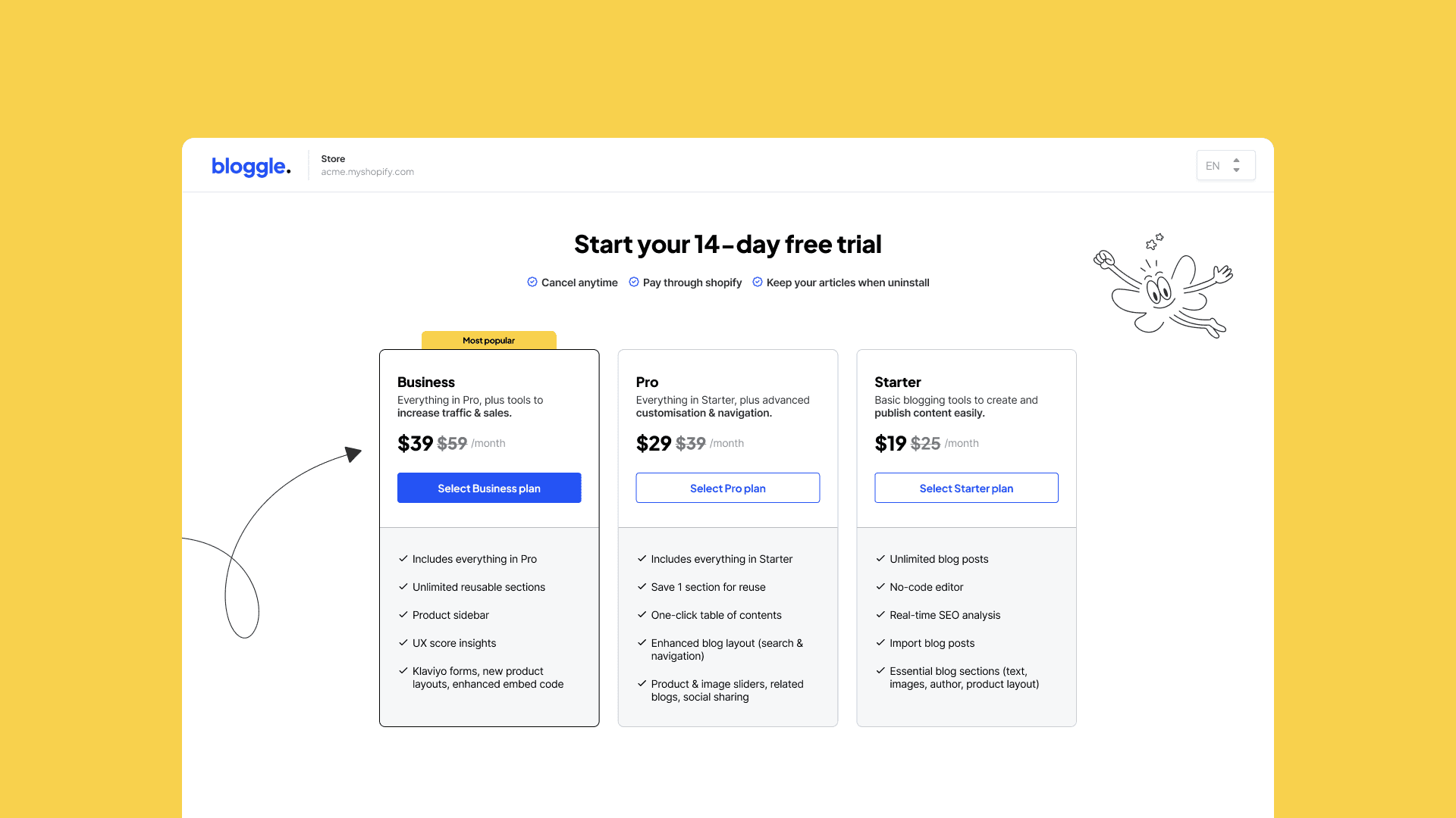
Card redesign
Created modular, visually distinct cards for each pricing tier to improve readability and comparison.
Used icons and typography hierarchy to highlight key features and differentiators.
Added clear CTAs - “Upgrade to Business” within each card to reduce friction.
Displayed included features vs. exclusive add-ons in a scannable list format.
Used a “Recommended” badge on the Business tier to guide user attention based on value.
Made cards fully responsive, ensuring clarity and usability across all screen sizes.

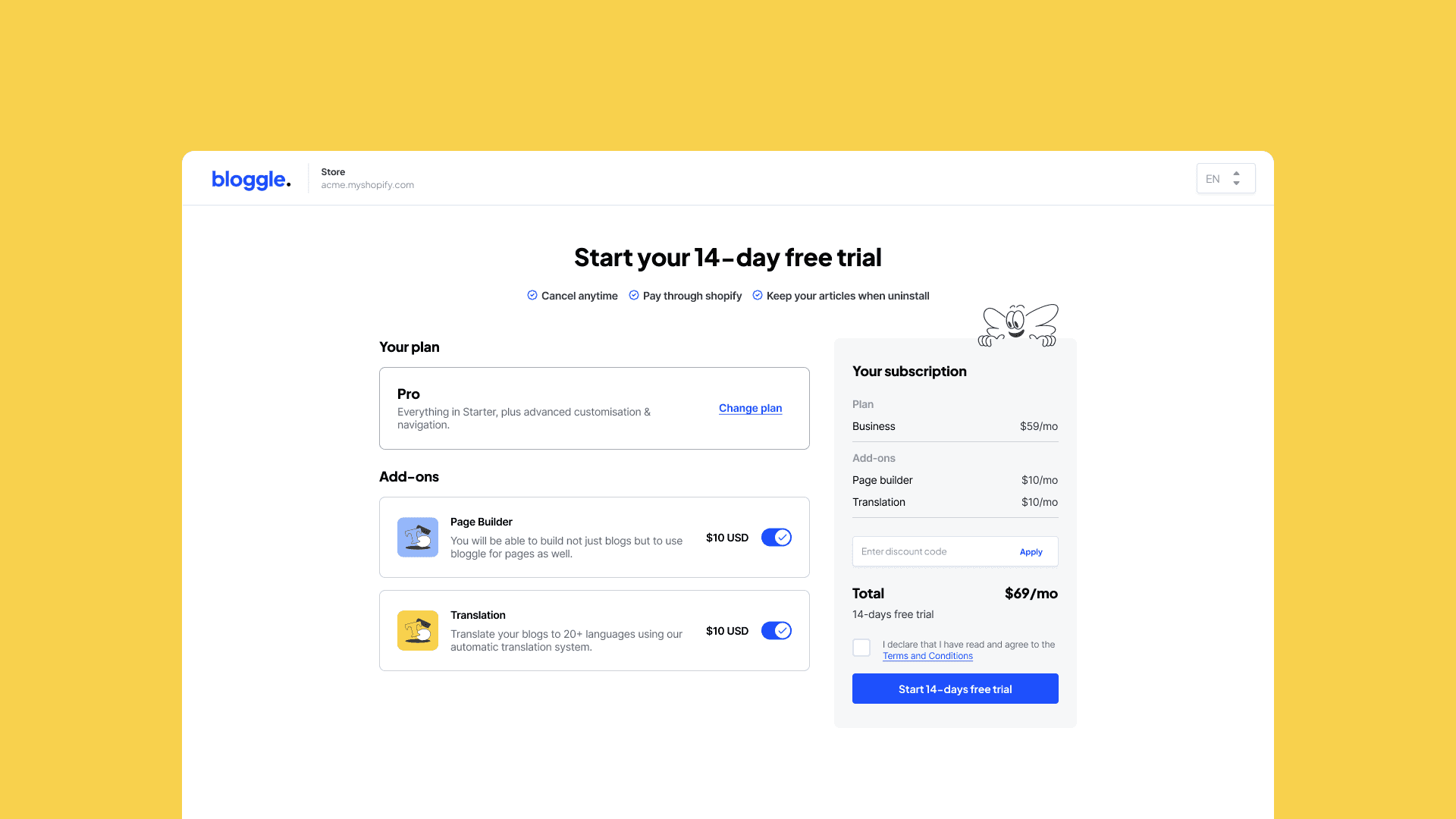
Two-Step Checkout Flow
Step 1: Choose a core plan (Starter, Pro, Business) with clear feature comparison.
Step 2: Customize with add-ons and review subscription details.
Reduces cognitive load by separating decision-making into digestible phases.
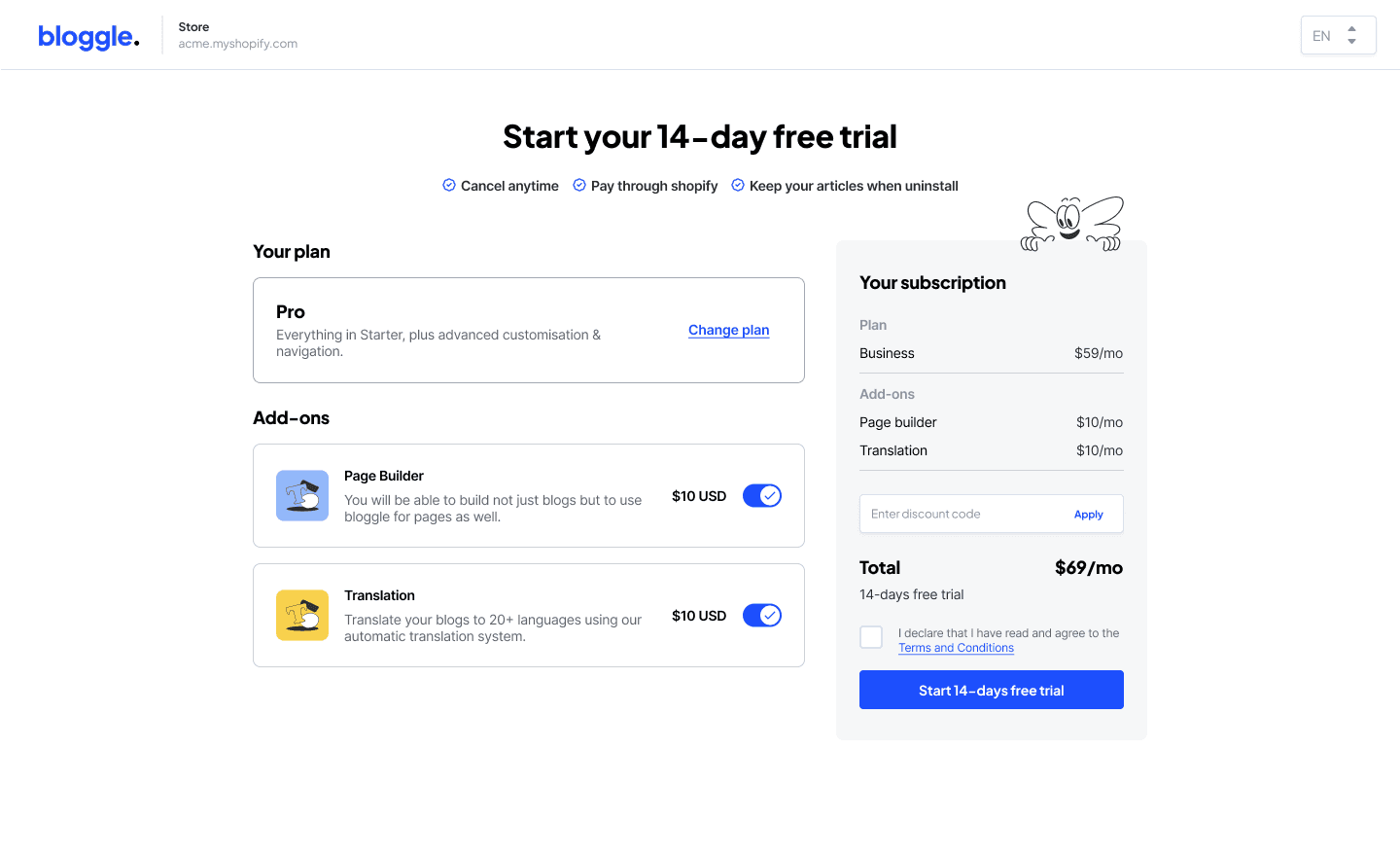
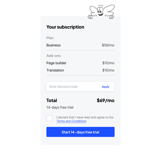
Dynamic Cost Breakdown Sidebar
Real-time pricing updates based on selected plan and add-ons.
Transparent subtotal, add-on fees, and final monthly total shown clearly.
Helps reduce billing confusion and unexpected charges.
KPIs
Chacho Herraiz, Senior Product Designer.
Contact me
Chacho Herraiz
igdh.creative@gmail.com
©Chacho Herraiz 2024