Design System - Blym AI
Blym is an AI-powered SEO writing tool designed for eCommerce brands, offering AI-generated blog posts, product descriptions, and content scoring informed by real-time SERP analysis. In its early stages, the platform lacked a unified design system, resulting in inconsistent layouts, unpredictable component behaviors, and inefficient handoffs between design and development teams—ultimately slowing down development and increasing QA overhead.
My responsibilities
Audit & Discovery
Audit: Conducted a UI audit of the entire product experience to catalog inconsistent elements and redundant UI patterns.
Developer Interviews: Gathered insights from engineers on pain points in implementation, naming conventions, and asset duplication.
Inspiration: Analyzed design systems like Shopify Polaris, Intercom System, and Radix UI to inform scalable component thinking.
Technical research
Before defining any components, we conducted extensive technical research to ensure the design system would scale across Blym’s AI-powered SEO editor and support rapid iteration. This phase included auditing existing front-end constraints, identifying framework limitations, and validating component feasibility in collaboration with the development team.
We explored:
Figma-to-Code Fidelity: Ensuring layout and spacing tokens translated accurately into our Tailwind-based design tokens.
Interaction Patterns: Evaluated hover, focus, and active states under real content stress (e.g. modals over tooltips, complex dropdown nesting).
Component Library Options: Assessed Radix UI and Headless UI as base libraries for composability and accessibility best practices.
Performance Impact: Compared render times and bundle sizes of potential patterns like modals vs drawers, and floating panels vs native overlays.
This foundation helped us make informed decisions about our architecture and choose scalable, performant patterns for Blym’s content-rich workflows. It also ensured that every design choice—from buttons to complex layouts—was technically sound and future-proof.
Storybook Build-up
To bridge design and development seamlessly, we implemented Storybook as the central documentation and testing environment for all Blym components. Each component—from atomic elements like buttons and inputs to complex structures like modals and steppers—was documented with its props, states, and usage guidelines. We established naming conventions aligned with the design tokens in Figma and synchronized UI behavior to ensure visual parity across platforms. This setup empowered developers to build with confidence, facilitated cross-team collaboration, and made QA more efficient by enabling isolated testing of each UI element before production integration. Storybook became not just a dev tool, but a living source of truth for Blym’s design language.
Pain points & solution
Pain
Disjointed visual language across modules (editor, onboarding, dashboards).
Solution
Introduced foundational styles—typography scales, icon system, color tokens, shadows, and spacing units.
Pain
Overlapping or redundant components caused design debt and slower dev speed.
Solution
Created a modular architecture of atomic, basic, and complex components for reusability.
Pain
UI behavior inconsistencies in dropdowns, modals, inputs, and feedback messages.
Solution
Standardized interaction patterns with defined states (default, hover, error, loading, etc.).
The Design System
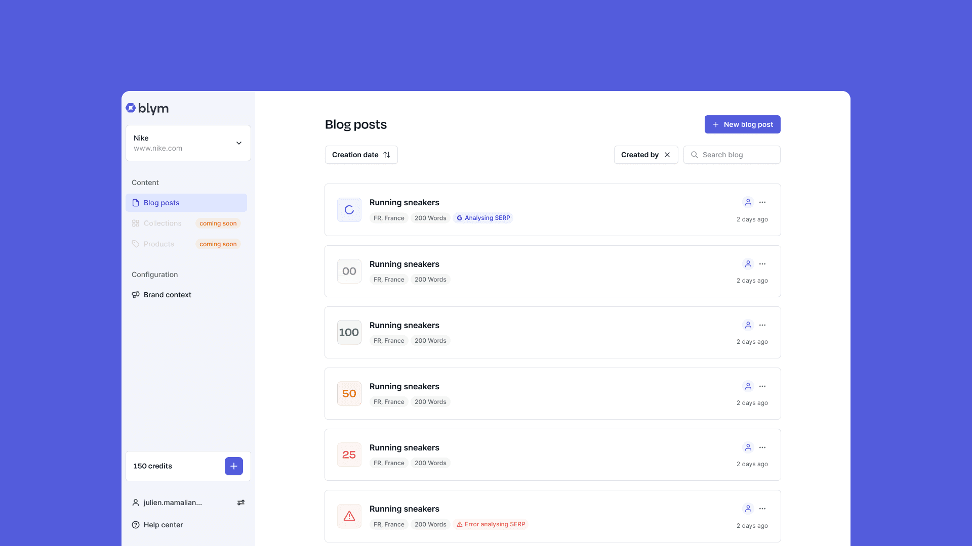
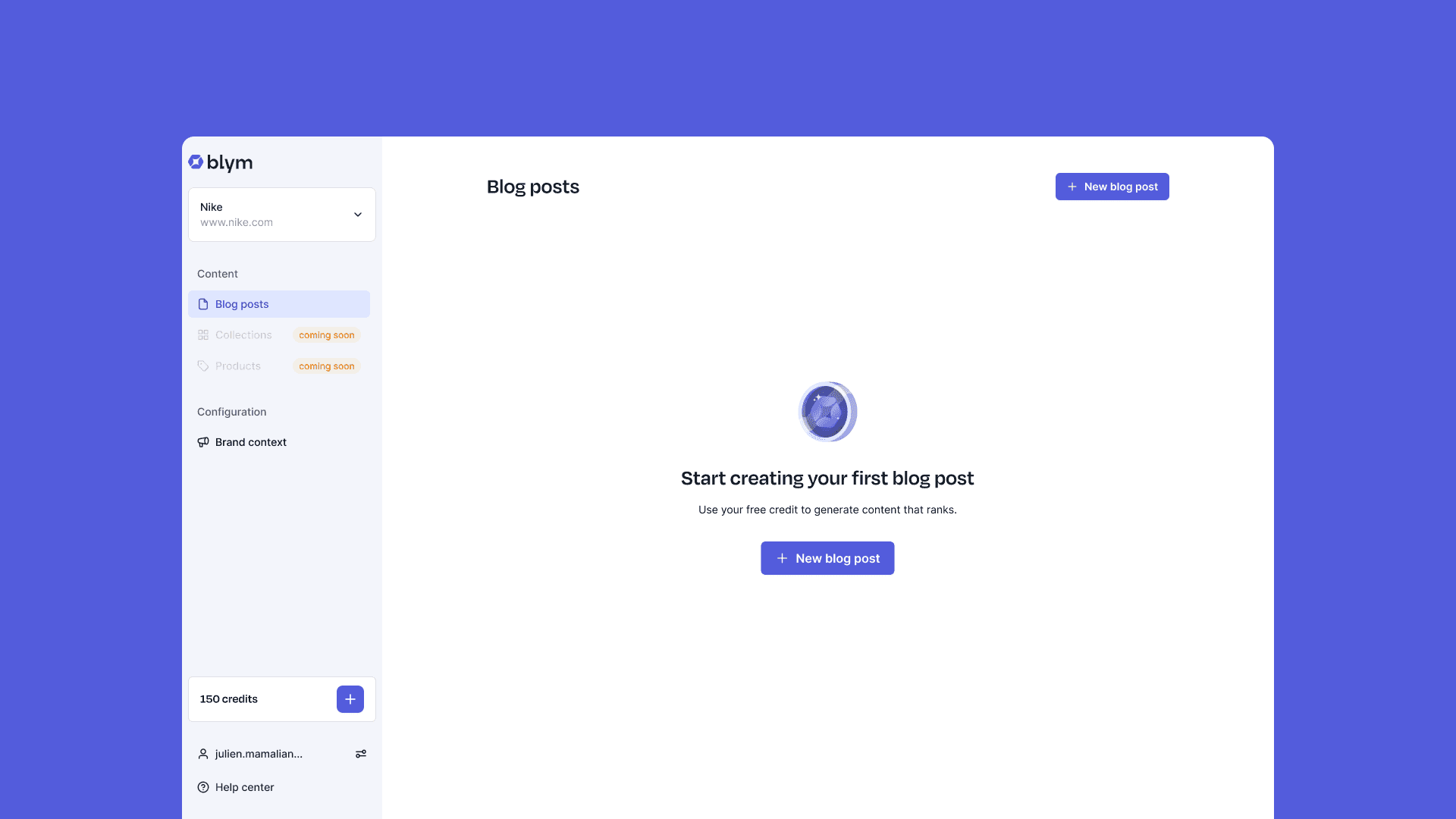
We ended up with over 50 reusable components, thoughtfully organized into foundational styles, basic UI elements, and complex interface patterns. These components were designed to be highly modular and consistent across the entire Blym platform. Some examples include foundational primitives like Buttons, Badges, Text Inputs, and Tooltips; interface-building blocks like Dropdown Menus, Tabs, Modals, and Steppers; and fully composed components such as the Sidebar, Credit Input Module, and Content Cards. Each was built to support responsive behavior, dark mode, accessibility standards (WCAG 2.1), and seamless integration with our Tailwind-based design token system. This component library now powers the entire user experience—across onboarding flows, the blog editor, dashboards, and beyond.
Here some examples:
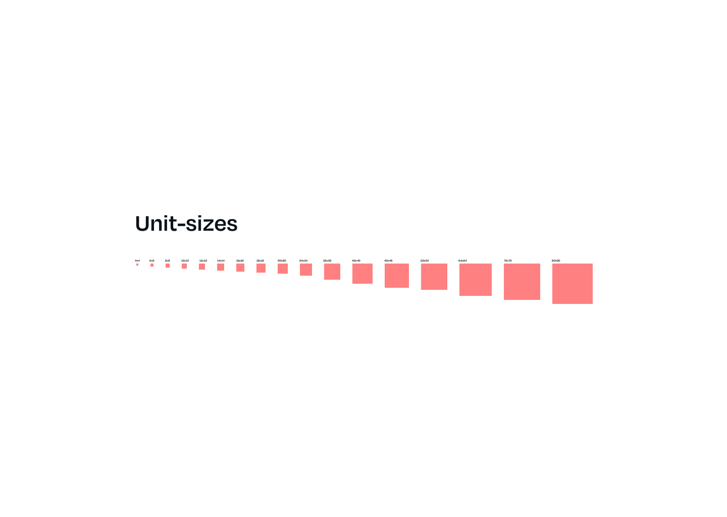
Basic styles
Buttons


Loading


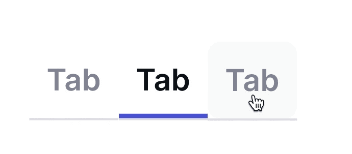
Navigation

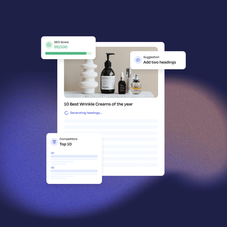
Complex components


KPIs
50+
Reusable components
38%
Reduction in dev build time
Improved
Handoff clarity between design and engineering teams
Chacho Herraiz, Senior Product Designer.
Contact me
Chacho Herraiz
igdh.creative@gmail.com
©Chacho Herraiz 2024